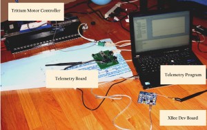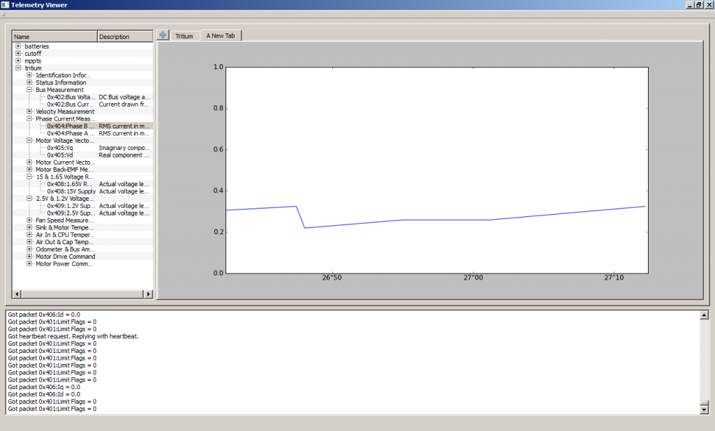
This Sunday, the Telemetry team met with Rafael to test their new telemetry program with the Tritium motor controller. With the telemetry board connected to the motor controller’s CAN bus, we were able to see all of the packets on our laptop as they were sent, including a graph of the last thirty seconds of data. There are still some bugs to fix and features to implement, but overall we’re quite pleased with the program so far.
The purpose of the program is to take the wealth of data being sent by the car and present it in a human-friendly way so that we can better monitor and understand the performance of the car.

Our new program has several exciting new features that we hope will make live data analysis much easier than before.
- Plots can be constructed on-the-fly. Instead of displaying only fixed plots of pre-selected data, the new program can make brand new plots by dragging and dropping signals from the selector pane into the main viewing pane. The selector pane displays a hierarchal list of all CAN Packets, their ID, names, and the format and meaning of their data payloads.
- Tabbed graphs to organize data. Our old program attempted to squeeze all of the graphs onto the screen at the same time, which made it impractical to see any one thing in detail. The new program splits up the plots into different tabs, each offering a different view of the car. For example, all of the battery cell information can be viewed from one tab while having another tab dedicated to the status of the motor controller.
- Important debugging information is user visible. Though we do our best to avoid bugs, they are inevitable, whether they happen in hardware or software. Accordingly, the new program tries to expose as much relevant internal system information as possible so that when something goes wrong, we have some idea why. Important events like connecting to the Telemetry board, synchronizing time, and hearing heartbeat requests are all logged and displayed in the debugging console on the bottom of the screen. This way, it’ll be easier to diagnose problems on the other side of the world.
- Data logging is separated from the GUI. When we run into the aforementioned errors in our program, it shouldn’t break data recording just because of some silly mistake in the GUI. All incoming packets are logged directly to the SQLite database in a separate thread before the GUI even gets a chance to see the data, so even if the window freezes up, the data will still be preserved.
Finally, this isn’t a feature per se, but we’ve switched from using a GUI built on the antiquated Tk/Tkinter library to one using the modern Qt library. Thanks to Qt via the PySide library, we were able to redesign the GUI in a matter of days, rather than weeks. With the faster development pace, we should be able to finish and add a few more features before our electrical system test this coming Sunday, including:
- Renaming/saving tabbed graph setups so that we can create, edit, and load different data views.
- Notifications for certain messages, like board error messages and status reports
- Smarter data scaling to make plots with multiple signals more readable
- Dragging and dropping graphs within the same tab to make more effective use of the space
