
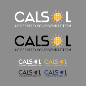
As we gear up for the 2018 American Solar Challenge, CalSol is excited to reveal our new logo! For 10+ years CalSol has kept our iconic “Flying Cells” logo as the center of our team’s branding. While this logo has served us well over the years, our new logo helps better represent CalSol’s modern existence and demonstrates our continued progression as a team.
When we set out to redesign our logo we wanted to both preserve our previous brand, while modernizing, simplifying, and increasing brand flexibility. Our new logo retains CalSol’s existing default blue and gold scheme, while also continuing the inclusion of solar cells as an integral part. The new logo also gives us more flexibility by including a circular icon, which is a useful form factor for digital media (something not heavily considered when we conceived our last logo in 2005). We are also introducing a number of alternate color schemes beyond our standard blue and gold, affording CalSol additional branding flexibility.
We hope you are a fan of our new logo! We will be rolling it out across our various platforms leading up to the American Solar Challenge. Stay tuned for exciting updates on both Tachyon and our final race with Zephyr.
By Ray Altenberg
well, it looks quite good, though it reminds me of a car fuel brand.